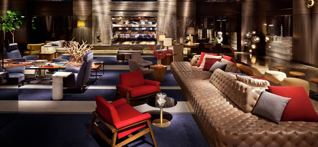
The Paramount Hotel
The Paramount (with the word hotel conspicuously absent from its name) would be more than a place to sleep. And no surprise given Schrager’s background in defining the quintessential New York night life during the late ’70s and early ’80s with both Studio 54 and the Palladium. The Paramount, as his mind’s eye saw it, would offer the best of services by bringing in some of the acknowledged tastemakers of their fields: Brian McNally would open a restaurant; Dean & Deluca, a branch of their gastronomie; Hubert Boukobca of the Parisian night club Les Bains Douches, a similar version. Imagine, says Schrager with all the enthusiasm as if this had been his first project, being able to ask the concierge where is the best restaurant in New York City and where is the club of the moment and having it all right here. “The Paramount is meant to blur the distinction between different entertainment spaces.” Integral to the concept was the role intended for the lobby. It would be treated not as a passthrough on the way in or out of the hotel, but as a destination place of its own for New Yorkers and out-of-towners alike. High on the glamour quotient, the lobby was conceived as analogous to salons of the past where friends would meet for conversation, cocktails or whatever. It all comes from the Normandie, says Schrager, showing us a large picture of the luxury liner in an office whose walls are covered with magazine pages of fashion shots, interiors, furnishings, gossip tidbits or anything else that might pique the interest of this man who has positioned himself on the cutting edge of style.
For the Paramount’s renovation, configuration and room count (610) would remain basically intact. The lobby, an impressive volume with 22-ft.-high ceiling and 4,500-sq.-ft. area, was razed and rebuilt. Here, Starck pulled out all the stops. The lobby is entered from an anteroom or so-called decompression chamber marking a transition from the chaotic streetscape to the elegance inside. In true Starck style, this first encounter with the hotel prepares one for the unanticipated, for the marble-faced vestibule is detailed with lighted niches and individual roses seemingly growing from within the wall. The lobby proper is simultaneously grand yet intimate in scale, thanks to the manner in which seating is arranged in small conversation-encouraging groups smack in the center of the space. Here too, the seating pieces represent a departure from the expected. There is no collection of Starck-designed chairs. Instead, Schrager and the designer collected off-beat pieces during trips to Europe; there is seating by Marco Zanuso and Franco Albini of Italy, Jean-Michel Frank of France, Antoni Gaudi and Carlos Riart of Spain, Jasper Morrison of England and Mark Newson of Australia. “Wouldn’t it be great,” Schrager recalls himself saying, “to have a collection that would be more sophisticated than the obvious?”
Much has been said of the lobby’s grand gesture–an off-center, canted stairway framed by a platinum-leafed wall on one side and a glass sheet railing on the other. Glamorous it is, and it also hints at a touch of danger given the slightly canted orientation. Yet as impressive as this stairway is, other details are equally worthy of note. The three elevator doors open to reveal the interior of each cab lighted with a different colored glow. “The elevator treatment cost only $1,400,” comments Schrager, “but it’s not about money. It’s about style and theatricality.” Then there are Starck’s whimsical postcard stand at the international newsstand, his full-height carved wooden vases for reeds, and the very human touch of small occasional tables with reading lamps and telephones. Adding another 3,000 sq. ft. to the public space is the newly built mezzanine, where framed seating groups, fronted by a glass railing, provide ideal people-watching posts from a stance just removed from center stage. The mezzanine also functions as the lobby bar.
Moving to guest rooms, Starck was faced with severely limited quarters. Rooms average 160 sq. ft. with another 35 sq. ft. for a foyer and 35 to 50 sq. ft. for baths. But small size and style are not mutually exclusive, as Starck proved, with all the requisite hotel room elements provided. The pair of bedside tables consists of tiered constructions of metal, marble and laminate, and incorporates both lighting and a telephone stand. Placed in a corner is the television armoire whose doors, when closed, form a small oculus that leaves visible the flickering of the turned-on set behind. A white writing table bears a distinctly Starckian stamp as does the slightly underscaled upholstered chair. Inspiration for the custom lighting fixtures came from a Brancusi sculpture seen at the Guggenheim museum in Venice. Pragmatically, the fixtures make use of existing electrical outlets; to address wiring needs, moldings were added. Most unusual, of course, is the headboard, a framed silkscreen of a detail from Vermeer’s Lacemaker. The painting, says Schrager, was chosen by himself and Starck on a trip through the Louvre. Of the subject, Schrager comments, “We thought it irreverent and funny to have someone looking over you.” Too, they wanted an Old Master’s work, but not an obvious choice with mass appeal. The single room rate, by the way, is from $90 to $110.
“We’re trying to package an image; we’re looking to create a magic moment…in a new kind of gathering place,” says Schrager of his and Starck’s efforts. “The details count; I’m not sure which one is most important, I think they all are.” Finally, Schrager says, the Paramount is an attempt “to capture the moment, and it’s not about economics and interest rates although the Paramount is a response to all this. I’m really trying to see which way the wind is blowing and anticipate what people want. The Paramount is the next generation of hotels.”


